Archives for category: Uncategorized

Donald Trump’s election win Mappiness users’ most miserable day in over 6 years

Today is the third Monday in January, sometimes known as “Blue Monday”. Formerly trumpeted as ‘the most depressing point of the year’, Blue Monday has been comprehensively debunked (both on this blog, and by Ben Goldacre: “Blue Monday” is churnalism, beware any journalist who puffs it and Blue Monday is churnalism. Again.).

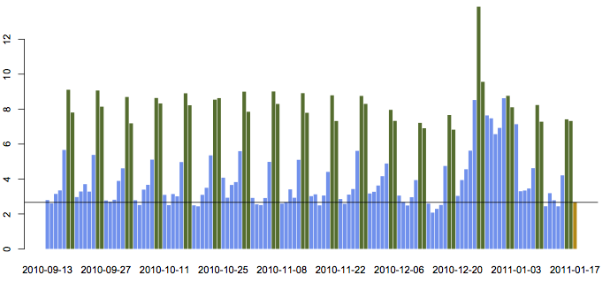
But this week, things may be different. Because Friday is Donald Trump’s presidential inauguration day. And new analysis of Mappiness data pinpoints the day of Trump’s election win — 9 November 2016 — as the UK’s most miserable day in over 6 years.

We used the Mappiness database — 3.5 million responses contributed by 65,000 users — to calculate mean happiness levels amongst our users every day since August 2010. In the six and a bit years that Mappiness has been running, there has been no day more miserable than Wednesday 9 November, the day the US election was called for Donald Trump.

At only 57.7% happy, Trump’s election victory was more thoroughly depressing than the gales, floods and power cuts of Storm Imogen (Monday 8 February 2016, 57.9% happy, rank #2). It was also worse than news of the UK’s decision to leave the EU[1] (Friday 24 June 2016, 59.2% happy, rank #4). Conversely, the happiest day over the full period of the Mappiness study to date was Christmas Day 2010 (75.7% happy), followed by Christmas Day 2011 (74.2% happy).

Beat the inauguration blues

If Trump’s inauguration looks set to ruin your week — or indeed the next four years — why not give mindfulness a go? Rebalance with Mindfulness, an innovative mindfulness app for iOS, is free on the App Store until the end of this month.

The app is developed by Mappiness creator and Sussex academic Dr George MacKerron in collaboration with PSYT. (George co-founded PSYT with Nick Begley, formerly Head of Research for mindfulness app Headspace, to help measure and improve happiness worldwide).

Mappiness 2.0

As of this month, the original Mappiness app is no longer in the App Store. The app was developed for iOS 3 and has reliability issues on the latest version, iOS 10.

However, academic research using the Mappiness data is ongoing. Published papers quantify positive links between happiness (in the moment) and green spaces, positive links between happiness and alcohol consumption, and a negative association between happiness and all aspects of work.

Existing Mappiness users are encouraged to keep using the app until the launch of its successor, currently under development in collaboration with PSYT.

Footnote

[1] The Brexit referendum result was, by definition, the preferred result for a majority of referendum voters — so why the negative association with average happiness? First, the negative effect of the result on the average remain voter was probably greater than its positive effect on the average leave voter. Second, Mappiness users and referendum voters are likely distinct, though overlapping, subgroups of the population.

Our first academic paper is now in press in the journal Global Environmental Change. (It’s taken a while, we admit — academic publishing is speedy like a sloth in treacle).

Many thanks again to all participants for volunteering the data that makes this research possible. Mappiness is still running, and we intend that this will be the first of many outputs based on the data that have been — and continue to be — contributed via the app

The really short version

Our key finding is there in the title: happiness is greater in natural environments.

Read the rest of this entry »

It’s been 6 months since our last post: we’re sorry to have gone quiet so long. George has been busy finishing the write-up of his doctoral thesis (thus hoping shortly to be Dr iPhone for real), and starting in a new post at UCL’s Centre for Advanced Spatial Analysis.

We’ve written a short paper on our initial findings. It’s titled Happiness is greater in natural environments, which should give you a flavour of what we’ve found. We hope to make it available here just as soon as a journal accepts it.

We still plan to keep the app running as long it’s being used, and to use new responses in future research. Right now we have over 3 million responses from over 46,000 people.

Read the rest of this entry »

Today we have launched our data download and API feature, which can be activated within the app after updating to version 1.1.

This post describes the API. If you don’t know what an API is, it’s probably safe to ignore it.

Read the rest of this entry »

Today we have launched our data download and API feature, which can be activated within the app after updating to version 1.1.

This post describes the content of the available raw data formats.

Read the rest of this entry »

23 May 2011: We’ve launched the data download and API feature, and this post has now been superseded by our data dictionary and API guide.

Frankie Roberto asks:

@mappiness_app hello. Have you thought about publishing an example of the future data export format? (So that we can start making apps now).

A great question. We hadn’t!

Initially we plan to provide data in JSON and CSV formats (with KML and iCalendar to follow), and provisionally this will work as follows. (Note that if you don’t know what JSON stands for, you can probably ignore this post).

Read the rest of this entry »

Inspired by the BBC’s logo QR code, we made our own. Boasting 50 × 50 pixel resolution, and in 11 glorious colours!

mappiness logo QR code

Scanning this with a smartphone app like RedLaser takes you straight to our website. (I know, I know, you’re already here. But if you weren’t, it might possibly be handy).

Please print and share — using this PDF for pixel-perfect vector blockiness.

Update: If ‘8-bit nostalgia’ means something to you, you might just enjoy Peasant’s Quest.

The TEDxBrighton mappiness talk is now available online. It gives a 17-minute overview of what we’re doing and why, and what we’re starting to find out from the data collected.

You can see it (and share it) in context on the TEDxBrighton site using this short link: http://mappin.es/TEDx. If you’re on iPhone/iPad/iPod you can watch it directly on YouTube. Or you can see it below.

This tweet of Ben Goldacre’s caught our attention yesterday:

ben goldacre (@bengoldacre)
17/01/2011 13:59
sigh. #bluemonday is trending. but #bluemonday is PR bullshit. humour me, RT and flood the tag. http://bit.ly/i21KLt

His linked blog post has more details: do have a look.

So, what do the mappiness data tell us about people’s happiness yesterday on ‘Blue Monday’, 17 January 2011?

First, a simple bar chart showing mean happiness responses, by day, since mid-September. Weekends are in green. Yesterday is in yellow, on the right, and a horizontal line is drawn across from that bar for comparison.

Averages

Nothing particularly special about ‘Blue Monday’ is apparent here. What mainly leaps out is just how happy the Christmas season is, including a huge upward spike on Christmas Day.

The time trend could, however, be confounded by the fact that our participants now are largely not the same people as our participants were in September: it’s plausible that happier or less happy people could have joined up at different times.

The time trend could also be confounded if there’s a trend in each individual’s responses, and if our average participant now is at a different stage of participation than the average participant was in September.

The chart below, therefore, removes variation between participants, and between different stages of participation, from the numbers being plotted. The scale down the left also changes, but since we’re interested in relative effects this isn’t really important. (The chart shows the residuals from an individual fixed-effects regression, which included dummy variables for various stages of participation. We added a positive constant to the residuals to keep the chart’s shape vaguely comparable to the one above).

Averages

These corrections do make ‘Blue Monday’ look a little worse. But there are still several less happy Mondays spread throughout the preceding months, and an even greater number of less happy Tuesdays.

So, for our participants at least, it seems ‘Blue Monday’ really is just PR BS.

It’s two months since we last posted here, which is undoubtedly too long: sorry.

Happy news

Prime Minister David Cameron gave subjective wellbeing research a big thumbs-up in a major speech last month (transcript, YouTube clip):

[T]oday the government is asking the Office of National Statistics to devise a new way of measuring wellbeing in Britain. And so from April next year, we’ll start measuring our progress as a country, not just by how our economy is growing, but by how our lives are improving; not just by our standard of living, but by our quality of life.

Cameron went on to quote from Robert Kennedy’s inspiring 1968 speech on the inadequacies of GDP as a measure of “that which makes life worthwhile” (you can hear Kennedy courtesy of the New Economics Foundation’s excellent National Accounts of Wellbeing).

Afterwards, the Prime Minister was shown details of work already being done to measure and explain wellbeing in the UK, with Mappiness being highlighted by Defra chief economist Richard Price. We’re keen to work with government to help understand links between environment and wellbeing.

mappiness presents…

We were invited to present on mappiness at last week’s Sustainable Development Research Network annual conference, and we’ll be speaking again at TEDxBrighton on 21 January. Tickets are free, and registration is open until Christmas.

Preliminary analysis

We’ve started joining response data with habitat data from the Land Cover Map 2000 and weather data from Weather Underground.

On average, people seem to be happier when outdoors in almost all kinds of natural environment than they are in cities. (We include lots of control variables in a ‘fixed effects’ regression, which uses only the variation within each individual’s responses, and treat the ‘Happy’ feelings slider as a linear scale from 0 to 100. We find that responses in natural environments are happier by between +1 and +5 points on the scale.)

People are less happy when it’s raining — and even less happy if they’re outdoors at the time. When outdoors, people are happier in higher temperatures and lower wind speeds too.

These findings are reassuringly intuitive (you might even say obvious). But what makes them exciting is that they don’t just leave us saying, for example, that ‘green space is nice’. Rather, they can tell us precisely how nice green space is, and how nice many other things are too, which may ultimately help us manage our environment better.

We hope to have an academic paper ready to submit by early February, at which point we’ll be able to provide more detail on these results.

Can we talk?

Since Mappiness is a pretty novel kind of study, we’re interested in doing some more qualitative research with participants. This would be looking at people’s experiences of taking part, probably through interviews or focus groups.

The details are by no means finalised, but if you’d be willing to be contacted about helping us with such research in future (with no committment), please send George a quick email.

What’s next?

Our current priority is giving participants access to their own data. This is a feature we’ve been promising for quite some time now, and will be accompanied by the ability to make textual notes alongside your responses — allowing you to add further explanation of particularly (un)happy moments, and potentially even to use the app as a kind of randomly-sampled journal.

We don’t yet have a fixed date for this update, but look out for it early in the new year.

When will it end?

We’ve had several emails asking how long the study will run.

We have no plans to close down mappiness while a substantial number of people are still participating. Today we’ll be sending one or more beeps to each of the 8,400 participants who are currently active, so we hope to be carrying on a while longer.

As it says in the sign-up information, though, you can take part for as long or as short a period as you like. There’s no cut-off point: response #576 is just as valuable as response #1. (And yes, one participant has provided 576 responses: if that’s you, many thanks!).

As soon as you’ve had enough – whether it’s after one beep or one thousand – you should feel free to opt out. You can: (a) set your ‘Beeps per day’ to zero in the app Settings, which retains access to your happiness charts, and will enable you to download all your data when that feature is ready; or (b) simply delete the app, in which case your charts and data will no longer be available.

In the meantime, it’s fantastic to have you on board!